23.11.13

Primary Research | Email Responses

Two of the six people gave responses to the questions that were sent out. One came back from Amy West stating that she would email and answer questions when she had the time, and the other two came back from DR ME, and Eric Hu.

The email sent to DR ME was responded by Eddy, who answered the questions in a personal way, referring to his personal practice as part of DR ME. Here is the reply:

Hey Emma,

Good questions.

So, do you enjoy using imagery to convey irony or pastiche? and why. 

We always like to evoke a small smile (or a laugh if we've really nailed it) when people look at our work, obviously there will be some people that scowl and think it's in bad taste but that's you can't please everyone or at least we hope not.
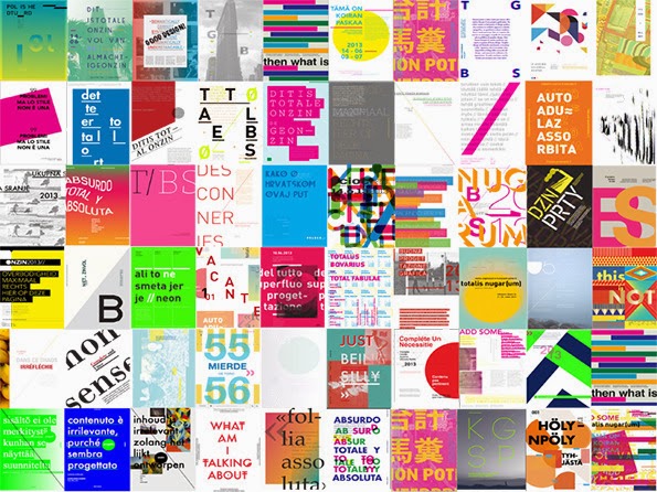
We tend to find that using imagery is the fastest way of doing this, one of my favourite pieces is a single sleeve for Dutch Uncles song 'Face In', it was supposed to be released before their second album to gain a bit of attention but the PR company got fired before the campaign hit the press so the single never happened, which totally sucked as it would've been wicked. It's my graduation picture with the face cut out and replaced with an upside down mountain, we thought it'd be really funny for the photo to have a use further than just sitting on my parents windowsill and of course the removing of the face sat quite nicely with the name of the song.

Here it is in fact:


Also, are you influenced by any postmodern designers, such as Tibor Kalman and April Greiman who take a similar approach to you, where collage, bricolage and humour are traits of the work.

I think although we both love design we're more influenced by art, this probably sounds a bit flowery but without people like Richard Prince, Bridget Riley, Gerhard Richter, Sol Lewitt, Miro we wouldn't have created half of the work we've created, that being said Kalman's work on Remain in Light really made me want to make record sleeves (even if the majority of that sleeve is made by Tina Weymouth from Talking Heads). When we met James Victore he introduced us to the work of Henryk Tomaszewski who if you're not familiar is an amazing Polish poster designer, people like him and Roman Cieszlewicz really made us realise that breaking things was the best way to make things beautiful.


Last question, how does technology play a role in your design process?

It's a tool, I cannot think of a single project that we've started on the computer that's been a success, we think a project should start in the mind and grow from there, it will then become clear whether the tool that you should use to realise it is a computer or a pen or a paintbrush or a piece of wood! The most fun you can have with technology is to use it with intelligence and an inquisitive mind, using things the way that they're not supposed to be used whether that is by throwing things onto a photocopier and hitting copy or dropping a disposable camera into bleach and then taking a bunch of pictures.

So, there you go questions answered, now, you owe us something, don't play it safe, that's all we ask of you, it's scary but please take our word for it, it's worth it, create amazing work that you love and don't concern with the opinions of others, work hard and you will succeed!

Merry Christmas!

Eddy

The response Eddy sent back was concise, and generally very interesting to read, and although personal to DR ME, he names specific influence and designers. Although they have been inspired by the likes of Tibor Kalman, it is hard to tell whether they would have even thought about postmodernism as a discourse whilst creating their own work, and the context and humour in which Kalman created his own work during the 1980s. It would seem as though due to more conceptual backgrounds in art, DR ME work in a very instinctive way, and are unconcerned in the content or context behind work that has influenced them. The bricolage, and appropriation methods they use are not consciously thought out, and so they are a good example of designers that produce postmodern work, that can have theory applied to in the contemporary.

The response DR ME came back to me with will almost certainly be integrated into the dissertation, along with a case study on their work.

Eric Hu was asked questions on postmodernism via his 'process' Tumblr blog. His replies were based on short anonymous questions. He replied to this question:


Hu seemed to respond in quite a defensive way, and perhaps the utter of the word 'postmodernism' made this so. (There is also the social issue of appearing cool.) He refers to postmodernism as a term with 'baggage' in reference to how the term has been used in the past few decades. Nevertheless he pointed out some nice Wikipedia sub-definitions for postmodernism, that however relevant they are, can still be defined by postmodernism as the metanarrative, or overriding discourse. Though it's unsure as to what 'post-internet' could possibly mean. He went onto say that graphic design's progression is 'non-linear', which, ironically would describe postmodernism, though Hu contradicted himself by indirectly saying that postmodernism is linear. Hu's response was disappointing, as he seemed to appear as if he knew what he was talking about in other text posts, but that does not seem to be the case. Or perhaps in this age of Tumblr meaningless bullshit, it boils down to having 'conflicts in opinion'. Of course there will never be a short hand way of describing postmodernism, and of course there are differing opinions, that is a fundamental characteristic of the term...and isn't that what makes postmodernism so damn interesting?

Whether this is relevant research to integrate into the dissertation is yet to be seen.

22.11.13

Primary Research: Survey Responses

Responses to the survey sent out to collect both qualitative and quantitative research. The results are quite interesting. I devised yes and no answers so statistics could be collected. They were made mandatory and required and answer, the comment boxes were left then open for the audience to either skip or answer.

68.42% of 19 people answered yes, they did feel they knew what postmodernism is. When asked for a short explanation or answer the responses varied enormously. These results compared to the same question and answer methods used for 'Do you feel that you know what modernism is?' the majority answered yes with 68.42% the same statistic as the yes and no answers asked for postmodernism.


Responses:

yes: 68.42% 13
no: 31.58% 6
Total Respondents: 19

If you answered 'yes' to the question above then please give your own definition of postmodernism in the box below.

Attempted controversy, breaking convention, derivative of modernism. Postmodernism is a lot messier, a lot more expressive.

Anything that came after modernism.

Opposite Modernism...chaotic, no structure or rules, rebellious, messy etc.

Movement in art & design, which broke the 'principles' which were defined by Modernism.

Post modernist art movement, early 20th century, David Carson's work, Andy Warhol.

the opposite to modernism - design that doesn't follow the rules and challenges structure and legibility

A reaction to modernism. Intended to break away and sometimes poke fun at the modernist rules and regulations of the past.

Postmodernism is was a style that went against modernism. It didn't take itself to seriously, it broke out of the rules created by modernism and was a lot more free in it's ideas and recycling other ideas.

The period in time which comes after modernism

There period in time after modernism.

I know some post modern designers. I do think that most 'isms' are just intellectuals needing to create a word to sell another book.

the opposing force of modernism that challenges what we've come to know as the norm either in physical or political terms. AKA 'alternative'

I believe that it is a text or medium that is self aware, often referencing or appropriating and traditional texts for the purpose of subversion. Irony, homage, pastiche and parody.

It's breaking away from Modernism and its conventions, more concerned with form as opposed to function.


Responses:

yes: 68.42% 13
no: 31.58% 6
Total Respondents: 19

If you answered 'yes' or 'no' to the previous question, then please give a short explanation for your answer in the box below.

I believe there's a lot of people trying to attempt to recreate that 'postmodern' design style in contemporary design, and if you can class that as postmodernism, then yes. But I believe it is no longer a thing in contemporary design, it's passed it's time, design now is either controversial or not.

It came after modernism.

In contemporary design, people just think of post modernism being completely oppose to modernism. You get people breaking rules, experimental design that explore many boundaries. Unusual colours usage for example.

It's recognisably something that has an aspect of a shock or aesthetic value rather particularly functional.

Modern artists and designers take inspiration from past postmodern artists, so elements of postmodernism can be found in contemporary design.

I believe so, however off the top of my head I can't really think of an example.. Possibly if you think about conceptual artists like Tracey Emin - a lot of her work could be described as postmodernist as she challenges rules of art and how you think about her work.

Any design that doesn't just do things for purist reasons.

I think that it can be seen in the varying different styles of design around at the moment. Surely everything that isn't modernist has elements of post-modernist design?

Probably i don't know what it is.

Postmodernism in design is when people use collage and such like to make existing works into new works through appropriation

Postmodernism in design is when you add strange colors and textures, doing things that were not there purely for function

Post modernism exists in the minds of people who have to overthink life to make a living.

design in this era is contemporary and we are definitely in a postmodern era.

Again, I think it's noticeable in design when precious texts have been referenced or a text is 'ironic'.

There are links and influences from postmodernism, but that era has finished.

There is now a mix between modern form over function and tradition


If you answered 'yes' to the question above then please give your own definition as to what modernism is.

Responses:

yes: 68.42% 13
no: 31.58% 6
Total Respondents: 19


Form follows function. Design which follows specific rules, for the purpose of helping the viewer.

Design that arose from technological advancement in the first 70 years of the 20th century.

Clean, Slick and Structural. OCD.

Movement in art & design, beginning from around the start of 20th Century. It's recognisable by it's form over function style aesthetic and principles.

Modernist art movement, late 19th - early 20th century. minimal, structured work.

Form follows function.

Modernism believes in design being functional and clean. Regimented and structured to create a universal style.

Modernism is a style of swiss design that uses clean shapes, layout and believes that form follows function.

The period in time before post modernism

Form follows function

Modernism is another ridiculous concept, made up by art dealers to sell things at a higher price.

minimalistic, form-follows functional design

Form follows function

Form follows function.


Responses:

yes: 10.53% 2
no: 89.47% 17
Total Respondents: 19

20.11.13

Amy West: Grafik BS: Case Study

I had looked at this project on It's Nice That, and thought it interesting a while back, however looking at contemporary trends in relation to postmodernism lead me to take a closer look. The project itself aims to take active research and focuses on the 'importance of communication in design'. On Amy's site, there are dual explanations for the project. One saying that Grafik BS is a design studio, and the other talking about the project itself.

Our parodies our culture of graphic design trends, and how the proliferation of blank images creates an environment where we use aesthetic we see, without any context or content.

The explanation for the project had a rollover feature where the real concept is revealed.


the project runs across to its very own Behance page where it keeps its professional facade.

The professional mask is used to gather active research into how people are taken in by aesthetics alone. She also generated a realistic looking Twitter account where promotions and networking would take place.


I emailed Amy on my subject of postmodernism in relation to contemporary graphic design trends, asking her if she agreed with what I was challenging.


Here is the rest of the project:


Primary Research: Survey Exposure

To give my survey exposure to as many potential people as possible, I posted it to the student notice board, although I would have preferred the course administrator to email my survey as I wanted it to be anonymous, but that is no longer allowed, so this may result in receiving less responses compared to an anonymous post. I also used Pinterest to get my survey to a wider audience, as my postmodernism board has 120 followers, I think realistically at least 10 people may respond, and as my survey isn't aimed at students exclusively I wanted to see if anyone else could respond.


Primary Research: What Is Postmodernism? Survey

I wanted to collect both qualitative and quantitative research from people that are creative, so the nearest and most accessible route that I could take was to generate questions for a survey asking people if they know what postmodernism is, and to give their own definition. To further my research I wanted to go on to ask people what modernism is, and then to give their own definition. I then finished the questionnaire by asking if postmodernism is an easy term to sum up. I tried to make the questions casual and approachable sounding, because although every single student in the college would have had a lecture at some point on both modernism and postmodernism I can understand that these subjects may sound elitist, and hard to sum up from memory.

Here are the questions I asked:


9.11.13

Primary Research: Emails To Professionals

Emails were sent out to contemporary graphic designers and creatives that will be looked at in conjunction with postmodernism theory research. Catalogue, Ill Studio, Hello Me, Eric Hu and Dr Me.
Some of them are probably quite cringy ways of asking about postmodernism, but the aim was simply to catch their attention so they would at least read what had been asked.

When postmodernism is talked about in any creative discussion, it feels like a sensitive word to have brought up, and so different methods of approach were used; although all of them sound as if they are setting off a sensitivity bomb, so it was a difficult subject to bring up. Eric Hu has a 'process blog' in the form of a Tumblr, and so the question was asked anonymously to have a better chance of a reply.


8.11.13

Ill Studio Case Study

Le Colette.

Ill Studio as contemporary practice in relation to Jameson’s theory on blank parody, ‘pastiche’.

“Curators, art directors, publishers, designers - it’s difficult to pin down exactly what Paris-based collective Ill Studio do.”

Dazed Digital article on Ill Studio project ‘72 Dots Per Inch’.

“The Internet has mutated into this infinite area of free creativity built around the notion of amateurism. Anyone can make his own animated gif, blog, photoshop hoax, meme, viral video and this all creates a massive mess
where cultural references which have nothing to do with each other mix, where reality is twisted, where any notion of time has disappeared, where bad tastes become good tastes. We like to mix-up very different cultural references in our work and Internet is an incredible source of inspiration for that.”

Ill Studio responds to a question Dazed Digital asked about the internet and online content.

“We wanted to do something about the Internet world for quite a long time and thought this exhibition was the perfect occasion. We've been quite obsessed by all this Internet amateur aesthetic for a while and we spend a lot of time wondering around on many different websites about very random subjects. Bart Simpson next to Marco Van Basten and a pineapple. This is the randomness that we wanted to capture through the exhibition.”

Ill Studio talks about the internet and how it influenced the content of the exhibition.

The 72 Dots Per Inch project aimed to depict the random nature in which imagery is compiled, and found on the internet. It also looks at 'free creativity' as Ill Studio label it, and the amateurism it ensues. In an interview with Dazed Digital, a suitably online sector of Dazed and Confused magazine, Dazed Digital asks, "As someone whose day to day work is based largely around the internet, how does the evolving nature of its content and ideas inspire the way you work?" Ill Studio answered, "The Internet has mutated into this infinite area of free creativity built around the notion of amateurism. Anyone can make his own animated gif, blog, photoshop hoax, meme, viral video and this all creates a massive mess where cultural references which have nothing to do with each other mix, where reality is twisted, where any notion of time has disappeared, where bad tastes become good tastes. We like to mix-up very different cultural references in our work and Internet is an incredible source of inspiration for that." Ill Studio simply observe this type of mass culture, rather than theorise it, which would suggest that using the internet to inspire creativity has become second nature. Ill Studio state that 'bad tastes become good tastes' and describe the internet as a 'massive mess' of 'cultural references', and because this statement covers such a large area, it is hard to discuss all of the reasons as to why the internet may have become this hybrid creative reference. Dazed Digital goes onto ask, "What was your idea behind 72 Dots Per Inch?", with the reply, "We wanted to do something about the Internet world for quite a long time and thought this exhibition was the perfect occasion. We've been quite obsessed by all this Internet amateur aesthetic for a while and we spend a lot of time wondering around on many different websites about very random subjects. Bart Simpson next to Marco Van Basten and a pineapple. This is the randomness that we wanted to capture through the exhibition." Ill Studio talk about why the internet inspired them to set up the exhibition, where they talk about their obsession with 'amateur aesthetic', where 'Bart Simpson next to Marco Van Basten and a pineapple'. This juxtaposition they reference as an amateur aesthetic may reference digital moodboards that are perhaps in the form of a Tumblr blog, and if so, it's hard to tell why found imagery complied onto a digital moodboard would be considered amateur. Ill Studio do not state that Tumblr is the source of their observations, but undoubtedly Tumblr does display this kind of random juxtaposition. Ill Studio talk about amateurism, but fail to extend the reason as to why this aesthetic is amateur, which could suggest that they feel that anyone can exude creativity through composition of found imagery. If Ill Studio are commenting on a contemporary culture of found images regurgitated through the medium of a blog, and then placed next to contrasting images, then they may refer to accessibility, rather than creativity in itself. The internet is accessible to anyone and everyone, allowing people to create their own blog where they can generate any kind of content they choose. It could be argued that 72 Dots Per Inch shows symptoms of amateurism itself, where the same method of juxtaposition of found imagery is displayed, where he difference lies in the medium, ignoring Ill Studio as a professional practice. This in turn breaks down the boundary between amateur and professional. As the exhibition is largely a print project, Ill Studio make digital imagery tangible, and take the digital into the real world. Where random Tumblr blogs showcase random imagery, it becomes impossible to separate the concept for the exhibition from the source. This goes to say the project is a direct result of the proliferation of blank pastiche displayed through the medium of the internet. Though the project is a relevant observation, and comment on contemporary culture, it simply repeats an aesthetic that anyone has access to. It takes the accessible into an unaccessible realm, the art world. As Jameson stated in his work Postmodernism or, the Cultural Logic of Late Capitalism, "For with the collapse of the high-modernist ideology of style - what is as unique and unmistakable as yout own fingerprints, as incomparible as your own body (the very source, for an early Roland Barthes, of stylistic invention and innovation) - the producers of culture have nowhere to turn but to the past: the imitation of dead styles, speech through all masks and voices stored up in the imaginary museum of a now global culture." Which would sum up the project, where it uses instinct to repeat, and imitate something that already exists.

As Ill Studio have curated exhibitions, so they have also art directed for publishing and editorial design, in the form of Le Colette magazine. The magazine has an aesthetic that could be described as playful, and is visually colourful. It takes the content of any usual lifestyle magazine and displays it in a deconstructed manner. A basic colour way is used, in conjunction with an array of surface pattern, to form borders, and create a structure for the randomly placed content. This work mirrors the original aesthetic created by Memphis group, a furniture design and architecture collective, that were founded in 1981. As Rick Poyner points out in his work, No More Rules: Graphic Design and Postmodernism, he talks about Memphis Group, "Memphis objects were most striking for their use of plastic laminates printed with  a wild variety of of colourful patterns. Like roadside neon signs, laminates were identified with ordinary, 'undesigned' environments: coffee shops, ice cream parlours, milk bars, fast-food restaurants, and kitchens and bathrooms in the home." The visual style that Memphis had created was partially based on practicality and functionality of everyday environments, and so this took the modernist principle of form follows function, and turned this on it's head. Style over substance was the basis for the objects of desire Memphis would create. Other influences for Memphis were previous artistic movements Art Deco and pop art, and so this mixture of styles created something new and exciting. Memphis chose what they liked visually to inspire their work, and were open in talking about their influences. As Poyner goes onto quote the Memphis chronicler Barbara Radice, "The whole Memphis idea is oriented toward a sensory concentration based in instability, on provisional representation of provisional states and of events and signs that fade, blur, fog up and are consumed. ... Communication - true communication - is not simply the transmission of information ... communication always calls for an exchange of fluids and tensions, for a provocation, and a challenge." This places memphis as a pioneer of hybrid design, creating something new from older practices, aesthetics, and existing surface pattern. The laminate surface pattern incorporated into the furniture design designed by Ettore Sottsass and Nathalie Du Pasquier, have become popular patterns that have been incorporated into creative practices such as graphic design. Perhaps the most commonly used pattern was designed by Ettore Sottsass, which comprises of random wiggly lines, usually monotone placed over another colour. The magazine Le Colette incorporated similar surface pattern once created by members of Memphis, along with the linear shapes that create borders and platforms for the content that mimic the furniture that Memphis similarly designed. Ill Studio have not stated that Memphis have been an influence, though it is perfectly plausible that they have seen something else that mimics the aesthetic Memphis originally created. As Ill Studio make it clear in the project 72 Dots Per Inch, that they are influenced by what they see on the internet, images of Memphis pattern and furniture design may have been viewed online without knowing where their origins lie. Many other examples of graphic design exude Memphis style aesthetic, so another reason for the way the magazine looks and feels is the proliferation of the same aesthetic used by other designer since the beginning of the 1980s, and so Memphis style has become a sort of trend. Of course the Memphis style may also simply evoke a sense of nostalgia for Ill Studio. There could be many factors in the influence and process that Ill Studio went through to create something that mimics Memphis aesthetic so obviously.


Ill Studio, a French 'multi-disciplinary platform' founded in 2007, uses aesthetics originally created by Memphis and to a lesser extent April Greiman. They do not state any of their influences on their portfolio website, and simply state, "The studio evolves in various creative areas such as art-direction, graphic design, photography, typography and motion design, for both personal or commissioned works." Which only states the areas they work in. As Jameson talks about blank pastiche, in Ill Studio's case, their practice suggests that blank pastiche itself has proliferated since the 1980s, and even the 1990s. If Ill Studio are in fact knowledgeable about Memphis, Greiman, and other postmodern forerunners in graphic design and architecture from earlier decades, they haven't made it clear, and public opinion would also confirm that Ill Studio believe that they are forerunners in innovation and new aesthetic. In a short post by Grain Edit, an online creativity blog, they said, "Ill Studio is a Parisian design studio with an incredibly experimental edge. They have just released a massive update featuring some beautiful typography-based projects. I’ve been a fan of theirs for years, and love their effortless propensity for creating an inspiring and very new set of work. With each new iteration of their portfolio they get better & better at honing their craft, while maintaining a very specific nod to the past with classic styling and type choices." They use the term 'very new' to describe Ill Studio's work which would suggest that their type of work has never been seen before. Another short review by blog Design Work Life said, "Dang! These folks in Paris are doing it right. Ill Studio finds a good balance between work and play. Maybe it’s work and play within each project? Whatever the balance, the product is bizarre and fun." Design Work Life have taken it up a notch, describing Ill Studio's work as 'playful, bizarre and fun', with enthusiasm that sounds as though the folks running the blog are astounded by the work. Not to say that Ill Studio have produced some fun and playful work, it could be described as a stretch to call it new, as some key examples of their work would suggest direct influence from Memphis.


Il Studio And Design For Music

Para One.


Audible Visions.


Africa Samples.


Sound Pellegrino.


Marble Music.

Ill Studio: Symptoms Of Contemporary Postmodern Graphic Design?

Ill Studio.
'Founded in 2007, Ill-Studio is a multidisciplinary platform based in Paris. Headed by LĂ©onard Vernhet and Thomas Subreville, it also brings together Nicolas Malinowsky, Thierry Audurand, Pierre Dixsaut and Sebastien Michelini.

The studio evolves in various creative areas such as art-direction, graphic design, photography, typography and motion design, for both personal or commissioned works.

So far, Ill-Studio has collaborated with various clients such as Nike, Supreme NYC, The New York Times Magazine, LVMH, Cire Trudon, GQ Magazine, Orange, Sound Pellegrino, Christophe Lemaire, Adidas, l'Officiel Magazine, Uniqlo, Domus magazine, etc.'