In the mid-1980s two names changed graphic design: Macintosh and Tibor. The former needs no introduction. Nor, with various books and articles by and about him, does the latter. Tibor Kalman, who died on May 2, 1999, after a long, courageous battle with non-Hodgkin's lymphoma, was one of the few graphic designers whose accomplishments were legend within the field and widely known outside as well. Tibor may not be as influential on the daily practice of graphic design as the Mac, but his sway over how designers think—indeed, how they define their roles in culture and society—is indisputable. For a decade he was the design profession's moral compass and its most fervent provocateur.
- Tibor as a 'moral compass' as AIGA describes him describes Kalman's postmodern way of thinking.
 |
| Farrelly, L. (1998) Tibor Kalman: Design and Undesign. London: Thames & Hudson. |
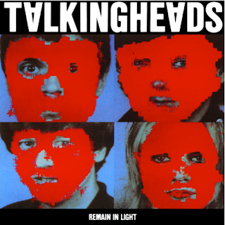
Not since the height of American Modernism during the late 1940s and 1950s had one designer prodded other designers to take responsibility for their work as designer-citizens. With a keen instinct for public relations, a penchant for Barnum-like antics, and a radical consciousness from his days as an organizer for SDS (Students for a Democratic Society), Tibor had, by the late 1980s, become known as (or maybe he even dubbed himself) the “bad boy” of graphic design.
- Kalman described appropriation work as morally wrong, though took existing imagery to create his own designs, though this existing imagery was not 'designed', this was still slightly contradictory. Kalman saw graphic design as 'mass communication', and so graphic design was inherently part of mass culture.
Colors was “the first magazine for the global village,” Tibor announced, “aimed at an audience of flexible minds, young people between fourteen and twenty, or curious people of any age.” It was also the outlet for Tibor's political activism. In his most audacious issue devoted to racism, a feature titled “How to Change Your Race” examined cosmetic means of altering hair, lips, noses, eyes, and, of course, skin color to achieve some kind of platonic ideal. Another feature in the same issue, “What If...” was a collection of full-page manipulated photographs showing famous people racially transformed: Queen Elizabeth and Arnold Schwarzenegger as black; Pope John Paul II as Asian; Spike Lee as white; and Michael Jackson given a Nordic cast. “Race is not the real issue here,” Kalman noted. “Power and sex are the dominant forces in the world.”
- Colors as a publication does function to sometimes shock the audience, although Colors has always been conceptualised around a single subject, does this aspect in itself feel postmodern, where new concepts function for publication design?


No comments:
Post a Comment